For eCommerce brands in competitive product categories, simply having an Amazon Storefront isn’t enough. To win on Amazon marketplace, you need to give shoppers an immersive brand experience that makes them choose you over the rest.
We’ve got you covered with 11 store examples to fuel your creativity, plus the latest best practices to build trust with shoppers and win more sales.
What Is an Amazon Storefront?
An Amazon Storefront, sometimes referred to as Amazon Brand Store, is a self-managed, customizable page on Amazon that lets eCommerce retailers showcase their brand and products. Within Amazon-provided templates, companies can use banners, images, and text to tell their story and feature different products in engaging ways.

Increase RoAS on Amazon By 100%
See how our formula improves your advertising KPIs in 8-12 weeks in almost every category.
11 Amazon Storefront Examples to Inspire Your Brand
An excellent Amazon Storefront is all about user experience. As soon as a shopper lands, they should feel immersed in your brand. They should also see clear next steps to learn more about your products and move toward making a purchase. These 11 examples totally nail it.
1. Crocs
Crocs offers light-hearted and lightweight footwear for any occasion and every season. Its storefront is a vibrant splash of color and engaging imagery with a hero image that showcases the wide range of Jibbitz charms available. The first three large images cater to Crocs’ different target segments. Further down, there’s shopping by category and branded collections, with links to category pages.
What Crocs gets right:
- Targets different audience segments with tiles: kids, women, athletes
- Navigation bar is straightforward: new arrivals, women, men, kids, etc.
- Amazing use of color and fun imagery centered on the customizability of Crocs and the “Come as you are” tagline
➡️ Check it out
2. PK Grills
Grilling is all about making delicious food, and the PK Grills storefront drives this home with videos featuring meat and veggies cooked to perfection on a popular product. The top of the page is visually rich with videos and photos. Scrolling down, the shopper sees clean and straightforward product images and links.
What PK Grills gets right:
- Several different videos show products in use
- Clear and to-the-point product descriptions
- Wide array of links to product pages
➡️ Check it out
3. La Maison Du Chocolat
Eat your heart out, Godiva. La Maison Du Chocolat’s storefront oozes luxury with a sophisticated white marble backdrop unifying several images, including the hero image. The storefront design includes visually engaging tiles that use a variety of media, including video and photos. Shoppers can navigate the storefront to view different categories (e.g. truffles, macarons). Further down, there’s a nice section on the brand’s quality and sustainability values.
What La Maison Du Chocolat gets right:
- Uses a luxurious aesthetic to elevate product and brand perception
- Incorporates a mix of photos and videos for a dynamic browsing experience
- Highlights the brand’s values for ethically conscious consumers
➡️ Check it out
4. LEGO
As a beloved toy for all ages, LEGO’s Amazon Storefront homepage speaks to fun and whimsy for kids and adults alike. The page showcases new products first, followed by products organized based on overarching themes like Super Mario and LEGO Botanicals. Customers can shop by style, age, and theme, catering to unique product needs.
What LEGO gets right:
- Use of bright, eye-popping colors consistent with its brand
- Highlights products based on audience and themes
- Showcases holiday-themed sets to capture more sales during peak season on Amazon
- Features an interactive LEGO gift finder that suggests products based on who users are shopping for
➡️ Check it out
Bonus Example: Amazon Influencer Storefront (LEGO + BrickinNick)
Wondering about influencer partnerships? Amazon influencers can create their own storefronts featuring their favorite products. Self-proclaimed LEGO Master BrickinNick is one such influencer, who focuses on LEGO products as well as gaming, tech, and streaming products.
➡️ Check it out
5. Callaway
Callaway caters to unique golfing needs with beautifully crafted and innovative, technology-focused products. Callaway’s brand is centered around being a leading name in performance golfing resources, including smart clubs and AI-driven tools. Upon visiting the sleek storefront, shoppers are immediately immersed in the brand experience with a full-screen video that autoplays before transitioning to the storefront.
What Callaway gets right:
- Clean, crisp format
- Products are divided into easily accessible categories
- Visuals are very product-focused, simple and to the point
➡️ Check it out
6. Lenovo
Lenovo’s storefront makes excellent use of Amazon’s “background video tile” option by highlighting featured products with these soundless, auto-playing videos. Further down, navigation tiles organize products into straightforward categories like laptops and desktops, with accompanying product images to give shoppers a clear idea of how to find what they’re looking for. Near the end, there’s a customer story video that shows products in action and tells the story of how Lenovo’s products impacted a real customer.
What Lenovo gets right:
- Simple, clean formatting
- Many links to product categories and individual products
- Use of videos on Amazon to tell the brand story
➡️ Check it out
7. Beats
Beats, a brand best known for performance headphones, sets the stage with a stunning video of products in use, a moving piano soundtrack, and a celebrity endorsement from none other than Lebron James. This intro clearly communicates the company’s goal to deliver sophisticated, high-end tech. This storefront also includes category links and infographics highlighting the best attributes of key products.
What Beats gets right:
- Strong celebrity endorsement adds to the luxury feel
- Sleek, clean setup aligned with brand colors
- Graphics touching on the most important product features
➡️ Check it out
8. Petcube
Petcube’s Amazon Storefront, predictably but adorably, features happy pets. It highlights products designed to connect owners and pets when they’re not physically together. Media include photos of popular products, videos showcasing functionality, and text exploring exactly how pet owners can benefit—from around-the-clock security video to the ability to feed furry friends treats from afar.
What Petcube gets right:
- Videos and product images of the results of using Petcube products (happy pets)
- Clear descriptions emphasizing product highlights
- Content focuses on features as well as benefits (e.g. “peace of mind”)
➡️ Check it out
9. Nivea
In this storefront, Nivea, a personal care brand specializing in skin and body care, doubles down on the most identifiable aspect of its visual brand identity: its signature blue. Right away, shoppers see Nivea blue on every element of the storefront. The images and videos show a good mix of product images and the target end user enjoying the products. Near the top of the storefront, popular products like lotion and lip balm are featured. Further down, shoppers can navigate by category.
What Nivea gets right:
- Uses iconic blue for consistent branding across the storefront
- Features best-selling items at the top, guiding shoppers to popular choices
- Combines lifestyle images with product shots
➡️ Check it out
10. Tress Wellness
Tress sells DIY waxing products with messaging that centers on ease of use and a pleasant experience. This storefront is more text-heavy than some others, with content that speaks to quality, cruelty-free products, the use of essential oils for relaxation, and smooth, silky wax beads.
What Tress Wellness gets right:
- Soothing color scheme
- Emphasis on the safety of products, both in testing and customer use
- Colorful graphics, including looping videos that highlight the different scent options of products
➡️ Check it out
11. Vercord
Vercord makes organization easy with products designed to help customers organize their lives: purse inserts, travel organizers, closet storage, and more. As the line of products is intended to keep things more orderly, the Amazon Storefront for Vercord similarly showcases a clean, simple design. In addition to a wide array of products, shoppers can see how and where the items can be used, like organized drawers, closets, and shelving.
What Vercord gets right:
- Neutral color scheme
- Images and videos of products in use
- Clear product categories showing the depth of available inventory
➡️ Check it out
Best Practices for Amazon Storefront Optimization
If there’s one thing we know for sure, it’s that Amazon’s marketplace fees aren’t going anywhere but up.
By following the latest best practices for design and content, your Amazon Storefront can help you get more out of your investment in Amazon.
The following tips will help you set up an Amazon Storefront that creates a great first impression with shoppers, drives traffic to your DTC site, and helps you win more sales both on and off Amazon.
Read more: Amazon Demand Side Platform Attribution: Explained
Proof Points from Trellis Data:
- 41% higher conversion rate (CVR) from Storefronts that apply the top five design best practices (n = 34, 60-day average).
- 53% of total Storefront traffic comes from external sources—showing that off-Amazon marketing drives meaningful conversions.
Intuitive, Value-First Navigation
At the end of the day, shoppers aren’t visiting your storefront to experience your brand; they’re there to browse your products. One of your top priorities should be designing navigation that’s super user-friendly and intuitive.
Top navigation tips:
- Feature your most popular items front and center
- Organize your nav logically—by product category or end user are popular choices
- Put products, messages, and links that offer customers the most value at the top of the page
- Ensure all links are to live ASINs so there are no barriers to purchase for shoppers
Exciting Hero Image
The hero image is the first thing shoppers see when they visit your storefront. Use this valuable opportunity to show potential customers what your brand is all about.
Top hero image tips:
- Show your products in action
- Use photos of your target audience so shoppers see themselves using your products
- Incorporate your brand’s color palette
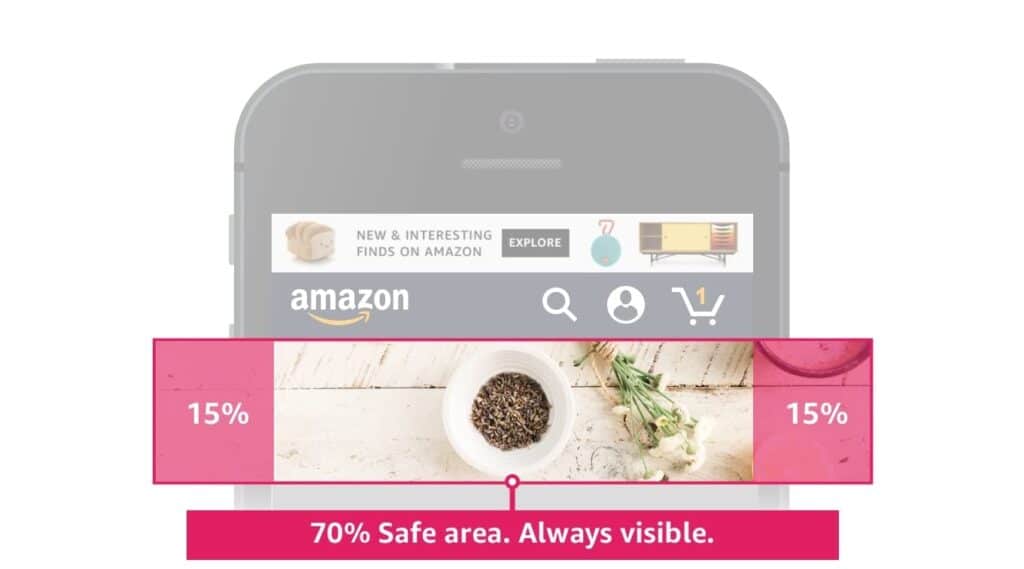
- Keep important visuals inside the “safe zone,” or the middle 70% of the image
- Make sure you’re using the right Amazon product image size

Image With Text Tile vs. Text Overlays
Because text embedded in images isn’t readable by search engines or screen readers, Amazon provides two native options to combine text and images on your storefront.
Text over image: Overlay text directly onto an image (prefix, heading, body, link)
Text next to image: Place text beside an image (header, description)
Top image with text tips:
- Keep text simple and high-level
- Make sure products stand out even without the text information
- Check Amazon’s guide for the latest image size specs
Strategic Images and Videos
High-quality images and videos are great ways to show your products in use, helping customers envision them as part of their everyday lives or as a solution to a problem.
There are two tiles of video tiles available on your Amazon Storefront:
Video tile: Shoppers must click to play the video, which plays full screen on mobile and inline on desktop. Includes a cover image shown before the user clicks play.
Background video tile: Auto-plays when visible on the screen. No audio and no video controls for the user.
Top image and video tips:
- Avoid overwhelming customers with too much media
- Design an enticing cover image for videos to encourage users to click to play
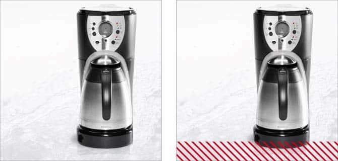
- For images, include important visuals in the safe zone, which is the top 81% for rectangle images and the top 88% for square images


Don’t stop at your storefront. Capture shopper attention and increase your conversion rate by adding video to your Amazon listings. (It’s easier than you think!)
Read more: How to Create and Analyze Amazon Content Using AI?
Immersive Brand Messaging
Use the elements of your Amazon Storefront to differentiate and strengthen your brand with shoppers. If there ever were a time to stand out, this is it. Whether it’s innovation, fun, or luxury—double down on your brand’s key characteristics with every image, color, word, and featured product.
Top branding tips:
- Feature the products that best exemplify your brand
- Thoughtfully select every image and video with your brand in mind
- Make sure your storefront’s branding is consistent with your other digital assets, like your website, social media, and ad creative
Shoppable Image and Product Tiles
Shoppable images and product tiles turn browsers into buyers. They showcase your products in real-life contexts and let shoppers purchase with a click.
Shoppable image: An image, typically a scene, where products are tagged. Customers can click to learn more about a tagged product.
Product tile: Highlights individual products with prices, descriptions, and Prime status. Links out to the full product listing.
Top product image tips:
- Highlight product benefits in context
- Ensure all product tags lead to live ASINs
- Optimize images for mobile
- Check Amazon’s guide for the latest image specs
Design the Perfect Amazon Storefront for Your Brand
A well-designed storefront can communicate who you are, what you have to offer, and why shoppers should click Buy Now. For brand operators focused on driving sales up and Amazon ACoS down, it’s a crucial piece of the Amazon positioning strategy.
At Trellis, we support brands across categories with AI-powered tools like Amazon dynamic pricing, product content generation, ad campaign automation, and more.
To see firsthand how our suite of eCommerce tools can take your Amazon Storefront to the next level, book a demo.
What makes the best Amazon Storefronts in 2025?
They feature a bold hero banner, at least three shoppable tiles above the fold, clear category navigation, review highlights, and lifestyle imagery that builds trust and connection. These design choices keep shoppers engaged and moving deeper into your catalog. Notable examples include Anker, Native, and Tushy—each shows how strong visuals and structure can convert browsers into loyal customers.
Brands that follow these design principles see measurable results. For example, Creative Crafthouse used Trellis to refresh its Amazon Store with seasonal visuals and keyword-driven modules. By combining smart design with data-backed advertising, the handcrafted puzzle brand scaled efficiently—achieving 1,200 percent sales growth during its peak season while maintaining profitability.
Amazon Storefronts: Top FAQs
Have more questions about Amazon Storefronts? Here are the answers to some common questions.
What Does an Amazon Storefront Do?
An Amazon Storefront serves as a customizable space where businesses can showcase their brand identity and product catalog. It lets Amazon sellers convey their unique brand narratives, highlight popular products, and create a shopping experience that drives sales and customer loyalty.
What Are Some of the Best Amazon Storefront Examples?
Some standout Amazon Storefront examples include LEGO’s vibrant design, Crocs’ audience-specific creative elements, and Petcube’s focus on features plus benefits.
What Are the Amazon Storefront Requirements?
To create an Amazon Storefront, you need a Professional Seller account rather than an individual account. Sellers must also be part of the Amazon Brand Registry, which requires a registered trademark. Storefronts must adhere to Amazon’s content guidelines, including image and video specs, and text placement.
How long does it take to build an Amazon Storefront?
Most Storefronts take about 4 to 8 hours to design and launch, depending on how many products and visuals you include.
Do I need a designer to make an Amazon Storefront?
No. Amazon’s Store Builder is drag-and-drop. You can create a professional-looking Storefront without any design experience.
What’s the best Storefront layout for 2025?
Start with a hero image and three shoppable tiles above the fold. This layout grabs attention fast and drives early clicks.
Can I track Storefront analytics?
Yes. Use Store Insights in Seller or Vendor Central to monitor traffic, clicks, and conversion rate (CVR) so you can optimize pages over time.
How do I optimize for mobile shoppers?
Preview every module on mobile before publishing. Use larger buttons, vertical image stacks, and minimal text so navigation stays smooth on small screens.


